

1. Product page
Problem:
When I opened the Homepage I got a full-width popup asking for my phone number. After closing it, I continued shopping, reached the product page and then got the same full-width popup again. That's really irritating and it distracts from the shopping.
Recommendation:
If you want to use that way of lead generation, make sure that you are at least show a limited number of the same popups per session/day/week, so users will not see the same irritating interstitials. Moreover, users usually perceive phone numbers as more sensitive personal information than emails, so I believe that it can have a lower conversion rate compared with email lead generation. Consider testing both options.
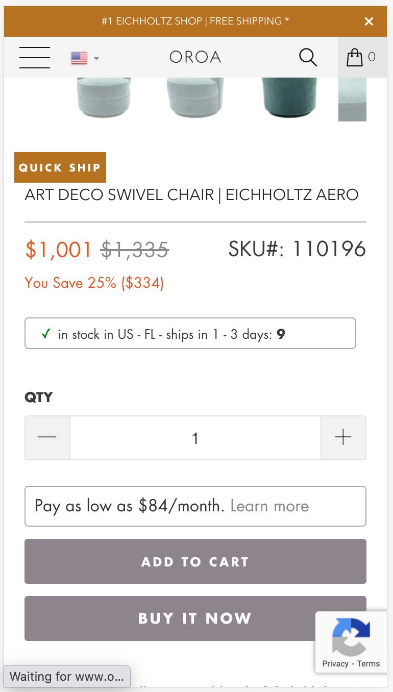
2. Product page:
Problem:
Below the image slideshow, you have a Quick Ship text which looks like a button, but it's not. Also, imagine that new users come to this page. Are you sure that they understand what that means? If not, that will just create more misunderstanding and unnecessary questions.
Recommendation:
At first, make sure that this element doesn't look like a button. Secondly, if you write something not entirely clear, add some explanation, i.e. "In stock: ready to ship it within 24 hours!". And the last one - consider placing it closer to the CTA-button, where it's more relevant than near image slideshow.
3. Product page
Problem:
The bad visual hierarchy for the most important actions - Add to cart and Buy it now buttons. These are the primary elements, but they are not the most prominent (the top shipping notification, payment icons are more prominent)
Recommendation:
Use brighter background color for the buttons if you want to have 2 prominent buttons. But I would suggest visually differentiate them. It's likely that the ATC button will be the most popular and desirable action, so it should be the most prominent element on the screen, while the Buy It Now button can be a less prominent, secondary element in the visual hierarchy.
4. Product page:
Problem:
"In Stock" and "Pay As Low As" elements have an incorrect design for such type of elements. These are just additional texts that provide users with more info about the shopping experience. But because of the borders, they look more like some clickable elements or/and dropdown list.
Recommendation:"In stock" element can be changed to pure text with some special colors to attract attention to it, while "Pay as Low as" would be better to place closer to the price, where this element will be more relevant, since it shows that you will not have to pay a full price, you can pay it in installments.
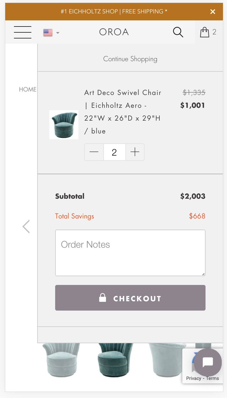
5. Sliding Cart
Problem:
When you click on the ATC button, the sliding cart appears on the part of the screen, while many other elements (online chat, part of the page, etc) remain visible on the same screen. All of these elements distract users from the main action on the Cart window - proceeding to Checkout and moving down the funnel.
Recommendation:
Make the sliding cart full-width, make sure that there are no unnecessary elements visible on the screen at that moment, so the whole attention will be focused on the Checkout button to motivate users to complete the purchase.
